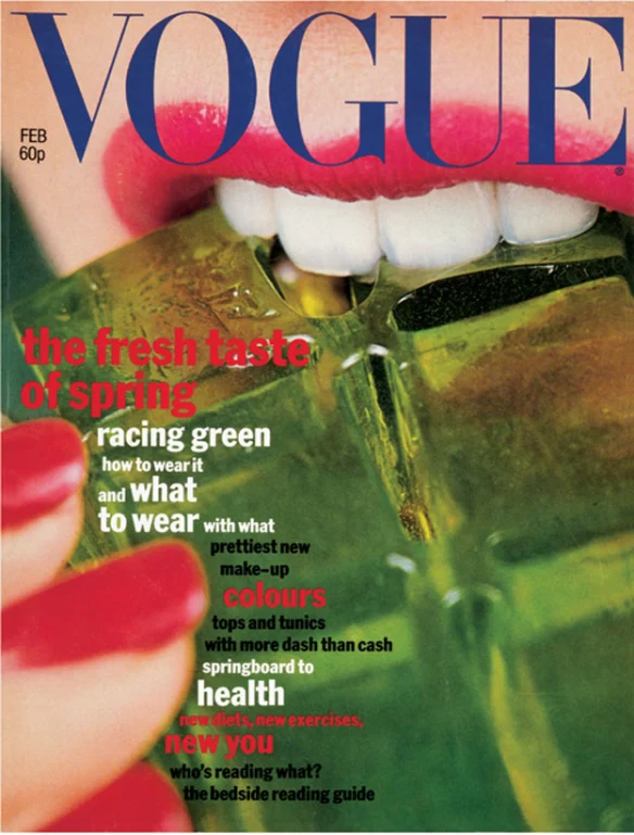
Vogue (1977) Vogue The Fresh Taste Of Spring Issue Magazine Cover [Photograph]. Available online: https://magforum.wordpress.com/2017/02/09/this-month-in-magazines-vogues-1977-green-jelly/ [Accessed 17/11/2022].
The use of colour in this 1977 Vogue spring issue I think is really interesting and effective. The main colour theme in this cover seems to be green and red, as these two colours are completely opposite each other in the colour wheel, this means that they are complimentary colours, so when paired together they make for a nice, visually pleasing effect. I really like the colours the designers chose for this cover, as green and red paired together usually are associated with Christmas, and wintertime, though this cover is a spring time issue. The use of complimentary colours and the contradictory themes of the colours makes the colour choices really interesting and effective, as the colours work really well together, it makes the cover look really visually pleasing and eye catching. I especially like the colour theme choice for this cover specifically, because I find that contradictory pairings can make something a lot more interesting yet also very effective. As the colours green and red are associated with Christmas, the colours themselves are very fresh and summery, green being associated with nature, and red being associated with love, these two colours being paired together from a spring/summer context, it makes the cover look a lot more interesting and eye catching. I also like the colour choice for the title, as its a warm toned deep blue, as the colours blue and red are very close to opposites in the colour wheel it means that the colours go nicely together and don’t clash with the rest of the colours in the magazine cover. Overall, I really like the use of colour in this cover, I like how the designers chose colours that aren’t usually used for spring/summer themes, though they work really well with the theme, I think it sets this cover apart from most summer magazine covers and makes the cover very effective in gaining an audiences attention.
Playboy (1965) Playboy Fourth Of July 1965 Magazine Cover [Photograph]. Available online: https://www.pinterest.co.uk/pin/692076667755421821/ [Accessed 17/11/2022].
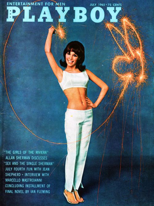
For an example of poor use of colour in traditional editorials, I found this really cool magazine cover that I felt could have been a lot better if there was a few different colour choices for the typography.
Playboy (1965) Playboy Fourth Of July 1965 Magazine Cover [Photograph]. Available online: https://www.pinterest.co.uk/pin/692076667755421821/ [Accessed 17/11/2022].
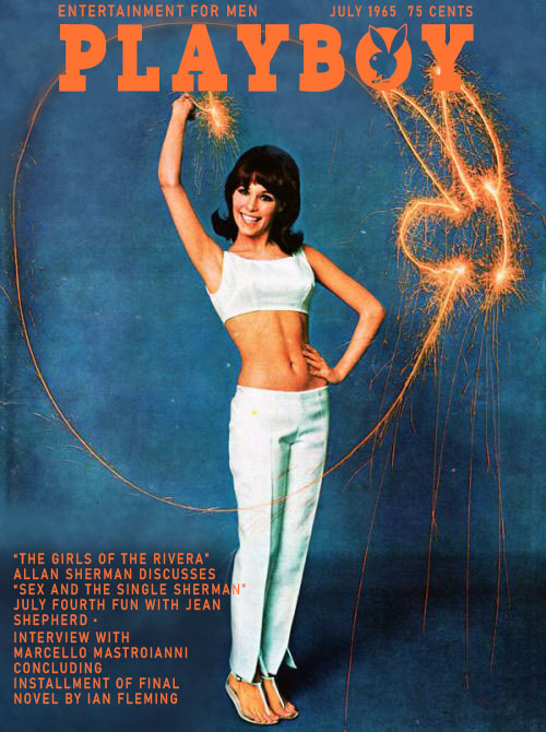
In the original Playboy cover, the main colour theme seemed to be dark blue and light/baby blue with pops of orange. Though I did like the idea of pairing orange and blue, as they are opposite each other in the colour wheel, meaning they are complimentary colours, I didn’t like how the typography was a lighter blue against an already blue background, I think it made the typography a little bit harder to read as there isn’t such a stark contrast between the type and the background. As there was already a little pop of orange in the cover from the sparks, I thought if I can change the colour of the typography to match the orange that is already in the colour, then the colour theme is a lot more complimentary and visually pleasing while also making the typography easier to read. To do this I went into Illustrator, swatches, and opened the Pantone colour books to compare colours to find the best to fit the cover, using the Pantone + solid uncoated colour pallet as I found it to be the most vibrant and true to the colours i wanted. I chose an orange colour that I thought looked nice, and compared it to the orange that was already on the cover, using the picker tool, the two colours were an almost perfect match so I decided to use the Pantone colour #ff6e2e from the solid uncoated palette for the typography. Using the brush tools, I painted over the typography to match the background, picking colours from the original background to make sure it looks nice and seamless. I then used the Playboy font I downloaded onto illustrator and made the title and added the orange Pantone colour i chose. I did the same for the rest of the typography, using a basic sans serif font, using that same orange colour so it all looks nice and consistent. I think my colour choices worked really well for this cover, I like the colour combination of blue and orange, I think its a really eye-catching pairing, I also really like that the typography is a little bit more visually pleasing to read as there is a heavy contrast between the two colours.
Full Reference List:
Vogue (1977) Vogue The Fresh Taste Of Spring Issue Magazine Cover [Photograph]. Available online: https://magforum.wordpress.com/2017/02/09/this-month-in-magazines-vogues-1977-green-jelly/ [Accessed 17/11/2022].
Playboy (1965) Playboy Fourth Of July 1965 Magazine Cover [Photograph]. Available online: https://www.pinterest.co.uk/pin/692076667755421821/ [Accessed 17/11/2022].
Vogue (1950) Vogue 1950 Mid-Century Fashions Faces Ideas Travel Handbook [Photograph]. Available online: https://www.whowhatwear.co.uk/vintage-vogue-covers/slide5 [Accessed 15/11/2022].
John Rawlings (1947) Vogue Magazine June 1st Summer Living [Photograph]. Available online: https://www.pinterest.co.uk/pin/132152570308189579/ [Accessed 16/11/2022].
Patio And Beach Umbrella [Photograph]. Available online: https://hklivingusa.com/products/doris-for-hkliving-beach-umbrella-classic [Accessed 16/11/2022].
Beach Hat PNG Images [Photograph]. Available online: https://www.pngwing.com/en/search?q=beach+Hat [Accessed 16/11/2022].
Vogue (1958) Running with the bulls Vogue cover [Photograph]. Available online: https://i.pinimg.com/originals/d5/89/91/d58991f9760ab16809764a0f2888d2d4.jpg [Accessed 09/11/2022].
Glamour (1946) Glamour for the girl with a job, Beauty and Home Planning Issue [Photograph]. Available online: https://www.vintag.es/2021/03/glamour-cover-1940s.html [Accessed 10/11/2022].
Teen (1965) Teen Young Americas Beauty Fashion and Entertainment Magazine [Photograph]. Available online: https://www.thatericalper.com/2015/04/19/the-best-vintage-teen-magazine-covers/extraordinary-vintage-teen-magazine-covers-2/ [Accessed 07/11/2022].
Playboy (1966) Playboy Bunny Love [Photograph]. Available online: https://www.pinterest.co.uk/pin/85709199148579079/ [Accessed 07/11/2022].