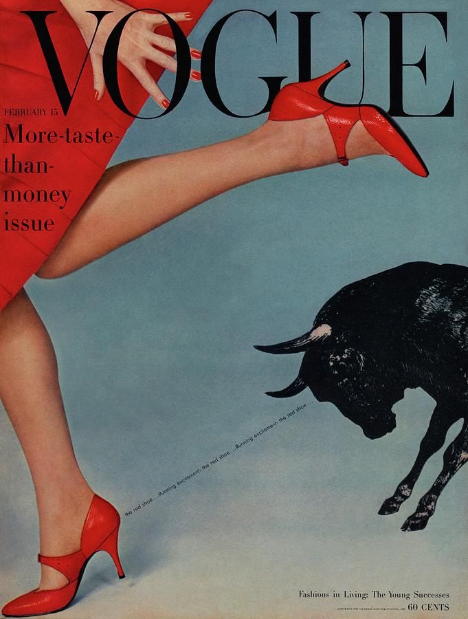
Vogue (1958) Running with the bulls Vogue cover [Photograph]. Available online: https://i.pinimg.com/originals/d5/89/91/d58991f9760ab16809764a0f2888d2d4.jpg [Accessed 09/11/2022].
For the use of conceptual design in traditional and online editorials I chose this vintage Vogue ‘more taste than money’ issue called ‘running with the bulls’ magazine cover, which I think is a great example of effective use of conceptual design in fashion magazine covers. In this example, the cover shows a woman’s legs wearing red shoes, you can also see the model is wearing a red dress and has her nails painted red. There is also a bull at the right hand of the cover, with it’s gaze being directed right at the red shoe. This design concept is using the idea that bulls are attracted to the colour red, and pairing this concept with fashion to make a whole new idea around the red shoe. To further apply more emphasis on the red shoe, there is also a very small, thin sans-serif font between the shoe and the bull, saying ‘the red shoe… running excitement’. The placement of the typography being an emphasis on the bulls gaze being on the red shoe. I think this concept is a really unique and interesting way to bring the audiences attention to the red shoe, I like that the designers used a familiar concept, such as bulls being attracted to the colour red, to further gravitate attention, as well as create a lot of emphasis around the red shoe. I also think the choice of the main colour for the magazine being red fits really well with this magazine being the ‘More taste than money issue’, and red always being a classic fashion choice, I think the emphasis on the colour red is a direct link to the fashion standards at the time, red being a tasteful and classy colour to wear. Overall, I think this is a great example of the use of conceptual design, and how effective putting ideas together to make a new concept can be when trying to attract an audience and bring attention to something specific.
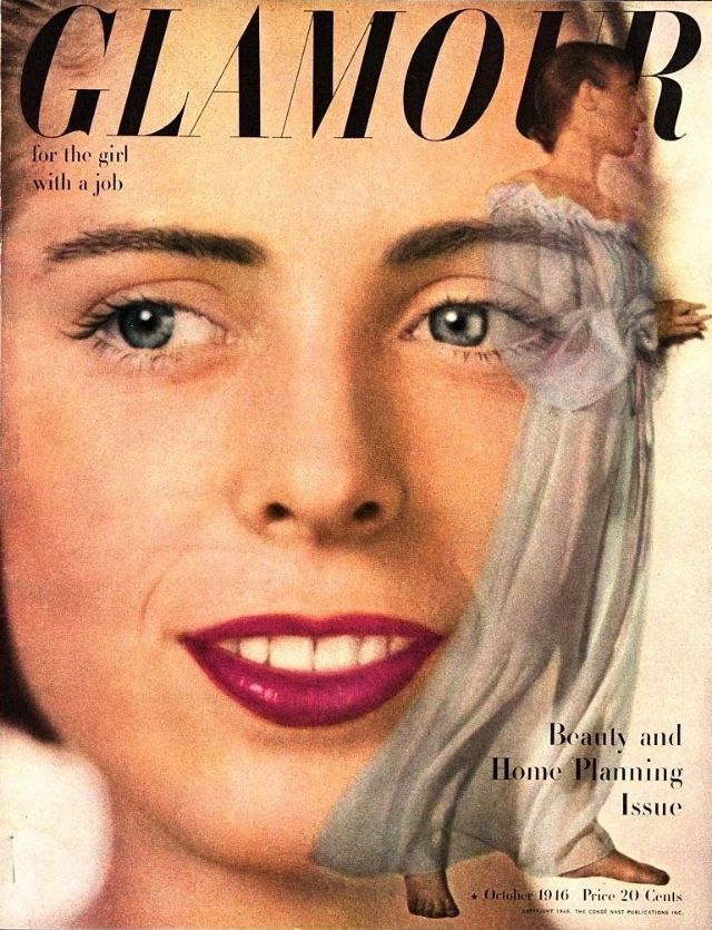
Glamour (1946) Glamour for the girl with a job, Beauty and Home Planning Issue [Photograph]. Available online: https://www.vintag.es/2021/03/glamour-cover-1940s.html [Accessed 10/11/2022].
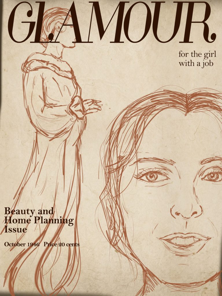
For my redesign of the Glamour magazine cover, I decided to sketch how I would conceptually design the cover using Photoshop. I decided I wanted to keep the cover very similar to the original design, as well as keeping it true to the other magazine covers in this collection. There is a theme throughout the collection where there are two images of the model within one cover, usually with one close up of the models face, and another full body shot of the model, this is to draw attention to what the model is wearing. I started by making a background for the cover, as these are vintage covers, I wanted to make the background look old to replicate that look of traditional paper magazines. To do this I made a blank canvas and using the paint tool, taking a light brown colour, and coloured in the canvas as a base, I then used a free old paper overlay image and pasted it over the background, turning the opacity down so you can see the colours under the overlay, adding a really nice old texture. I then started sketching the model on the cover, I decided I wanted to place the close up of the models face to the right of the magazine, with half of her face out of the shot, i found that this helped free up a lot of space for the full body image of the model, to sketch the model I used the paint tool in Photoshop. I then did the same for the full body image, using that same brown colour to lightly sketch the image, I placed the full body sketch to the left of the cover, adjusting the size so that the length of the sketch takes up the whole length of the cover. I think this placement worked really well, I think it looks consistent with the rest of the collection, and still looked very similar to the original cover. I then started to add the typeface, to get the title font I downloaded a free Glamour font and uploaded it into Photoshop, I wanted to make the font as close to the original font as possible, and I found that the font I added didn’t look quite the same, so I adjusted the characters length to make the font a little bit more elongated. I did the same for the space between the characters, making the spacing a lot closer together which made the font look a lot better. I then used the ‘Bell MT’ font in Photoshop to make the smaller typeface in the cover, I found that this font was very similar to the font in the cover. I used this font for the ‘for the girl with a job’ type, and used the same for the ‘Beauty and home planning issue’ but I found that the typography was quite thin and not very noticeable against the sketch so I made the font bold which helped with this a lot. I did the same with the date and price of the magazine. Overall I think my redesign is conceptually designed in a lot more of an effective way, I think the layout change brings the attention of the audience to the key features in the cover, as well as putting together two images to create emphasis on what the model is wearing.