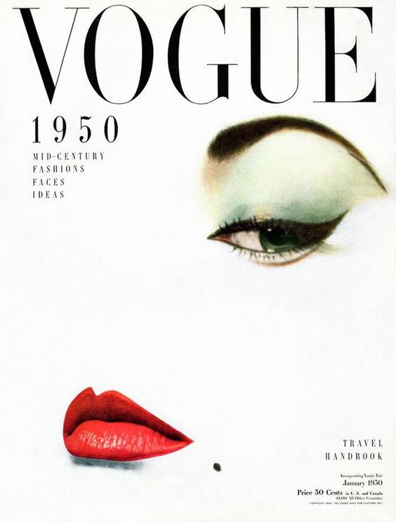
Vogue (1950) Vogue 1950 Mid-Century Fashions Faces Ideas Travel Handbook [Photograph]. Available online: https://www.whowhatwear.co.uk/vintage-vogue-covers/slide5 [Accessed 15/11/2022].
The use of composition in this Vogue 1950 mid-century fashions magazine cover is a great example of effective use of composition in traditional editorials. I really like how the designers used negative space in the cover, as there is a lot of blank space around the features within the frame, this brings a lot more attention to the features in the cover, in this case the eye and lips of the model. This is an effective use of composition as this creates more emphasis on the eye and the lips, and as this is a beauty magazine that is where the designers want the attention of the audience to go. I also think the placement of the features are very effective in making the cover look visually pleasing, as the eyes are placed at the top right, and the lips at the bottom left, this placement makes the cover look a little bit more balanced, as the features compliment each other to make the cover look more aesthetically pleasing. The same applies for the placement of the typography, with the title being at the very top, and the rest of the typography again being placed at the opposite quadrants, this further balances out the cover and compliments each other very well. You can see that the rule of thirds was used very well when designing this cover, as most of the key features in the cover fit into the quadrants of the image, and were placed within the guidelines to make a visually pleasing cover. While also effectively bringing the audiences attention to the key features of the magazine using negative space, as this magazine is about fashion and beauty, it would make sense as to why the designers would want the attention to be focused on the dramatic eye makeup and bold red lips. Overall I think this is a brilliant example of effective use of composition, as it is visually pleasing while also being successful in bringing attention to certain key features.
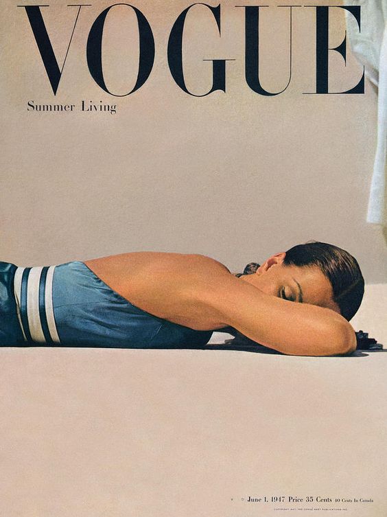
John Rawlings (1947) Vogue Magazine June 1st Summer Living [Photograph]. Available online: https://www.pinterest.co.uk/pin/132152570308189579/ [Accessed 16/11/2022].
John Rawlings (1947) Vogue Magazine June 1st Summer Living [Photograph]. Available online: https://www.pinterest.co.uk/pin/132152570308189579/ [Accessed 16/11/2022].
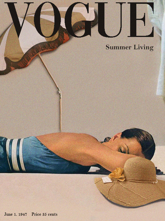
Patio And Beach Umbrella [Photograph]. Available online: https://hklivingusa.com/products/doris-for-hkliving-beach-umbrella-classic [Accessed 16/11/2022].
Beach Hat PNG Images [Photograph]. Available online: https://www.pngwing.com/en/search?q=beach+Hat [Accessed 16/11/2022].
For my redesign of the Vogue Summer Living cover, I decided I wanted to add a few more objects into the frame to help compliment the model in the cover, I also wanted to change around the placement of the model and some of the typography. Using Illustrator, I brought the original cover into the software as the background, I then selected around the model, copied and pasted it over the background and brought it lower down the cover so that the placement of the model is in the lower third of the cover. This I felt would help balance out the heavy bold title with something else at the bottom half of the frame. As the background is all one colour, I simply selected the brush tool and coloured over where the model was originally placed. I then started to add in the complimenting objects into the cover, I chose the hat and parasol images online, and brought them into photoshop to create a layer mask, and cut the objects out of their background images. I then saved the images and brought them into Illustrator to add them to the cover. I wanted these objects to compliment the key feature of the cover, so I thought if I can place one object on each outer quadrant of the cover, then it will balance the objects out and create a lot more of a visually pleasing cover. I also made sure to add shading and colour to the cut out objects so that they look consistent with the rest of the cover. I also applied the same technique with the typography, I kept the title the same, but I changed the placement of the smaller typography around so that the type are on opposing corners of the cover. I think this redesign was quite successful in using composition techniques to make an eye catching magazine cover.