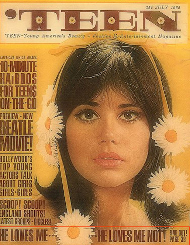
Teen (1965) Teen Young Americas Beauty Fashion and Entertainment Magazine [Photograph]. Available online: https://www.thatericalper.com/2015/04/19/the-best-vintage-teen-magazine-covers/extraordinary-vintage-teen-magazine-covers-2/ [Accessed 07/11/2022].
The use of typography in this vintage Teen magazine cover is a great example of using typography to intrigue an audiences attention. The font for the title of the magazine is a large, bold serif font, which makes the title appear very eye-catching, though this is contrasted with the delicate daisy’s within the large font, along with a font in smaller type just below the title, as this is a teen magazine cover, marketed toward young girls it keeps the appearance of lightness and youth. The font used for the headlines appears to be a sans-serif, bold, thick lettering, with varying sizing, this style of typography will guide the eye to read the larger fonts first, those being the main headlines. This use of typography is a great way to catch an audiences attention as the bold, clean, straight to the point font stand out more in an editorial in comparison to a elegant, thin font. I also really like how the creator has placed the typography around the model, with the main column of type being on the left, the title at the very top and another headline at the bottom acting like a border, this use of composition I find to be very effective as it is a great use of space, which is very important for fashion magazine covers as you want the model to be a focal point, as well as the headlines. I also really like the colour choices for this cover, the colour pallet being very warm toned, with yellows, off whites contrasted with the typeface being a warm dark chocolate brown further makes the type stand out to audiences against the rest of the cover. Overall, I think this is a good example of effective use of typography as it is very successful in drawing in a target audiences attention as well as capturing the essence of the magazine with the choice of font, colours and layout.
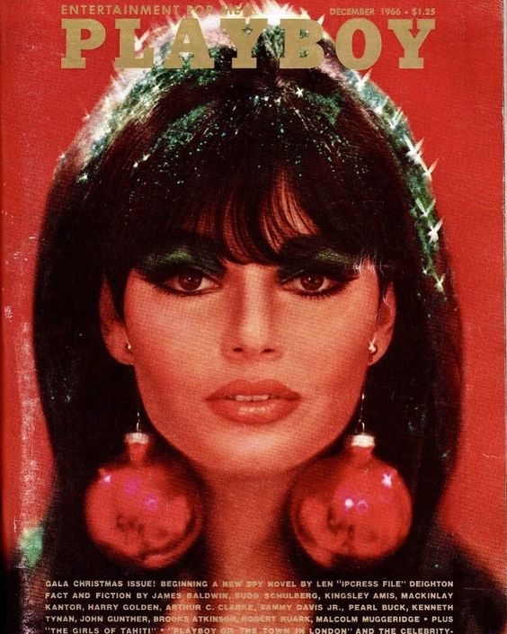
Playboy (1966) Playboy Bunny Love [Photograph]. Available online: https://www.pinterest.co.uk/pin/85709199148579079/ [Accessed 07/11/2022].
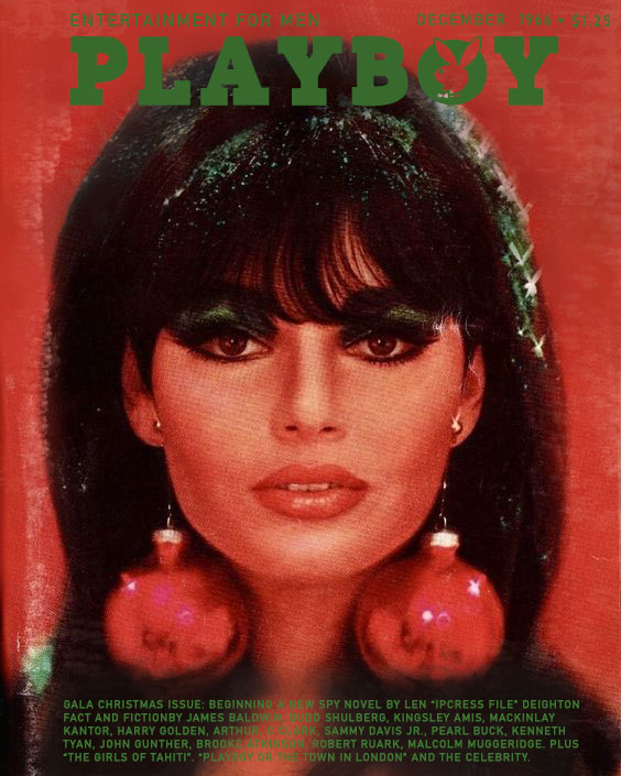
Playboy (1966) Playboy Bunny Love [Photograph]. Available online: https://www.pinterest.co.uk/pin/85709199148579079/ [Accessed 07/11/2022].
I chose to redesign this vintage Playboy magazine cover as an example of the use of typography and how design choices effects how the audience perceives an editorial, as well as how it can draw in an audience.
The first thing I thought to change to make the typography more effective in this Christmas issue Playboy cover was to change the colour of the typeface to stand out against the background, this will make it appear a lot more eye-catching. I wanted to stick with the Christmas theme, so I chose to change the title colour from gold to green, using illustrator. I’m really happy with my colour choice as the green stands out nicely against the red background, and the models dark hair. I found this to be really effective as there were already pops of green in the original cover, so the green fit in really nicely with the cover. I also applied the same for the smaller typography, keeping all of the fonts the same colour as the original had, I was especially glad that the smaller, thinner fonts popped against the background so much better, as i found those to be the hardest to read in the original cover with gold and red colour theme. I also adjusted the background photo using the paint tools to further make sure that the typography stood out, adding shading and highlighting to the image where I felt there needed to be more of a contrast. I also toned down some of the highlights where I found it bled into the fonts a little bit to make sure it all looked bright and easy to read. To make the title for my redesign, I downloaded a playboy font and accessed it through illustrator, as suppose to using any other bold, all caps font as I really wanted to make sure it felt like an original playboy magazine cover. I also liked that the font had the bunny in the ‘O’ of the title, I think it made it stand out just that little bit more. I re-added texture to the background using the paint tools to make sure it still looked vintage and grainy. I wanted to keep it as close to the original as possible while still improving the typography so if can be the most effective in capturing an audiences attention. Overall I think this redesign was quite successful, I feel that my design choices were effective in making the text easier to read, more eye-catching and bold without being so bold that it takes attention away from the model in the cover.